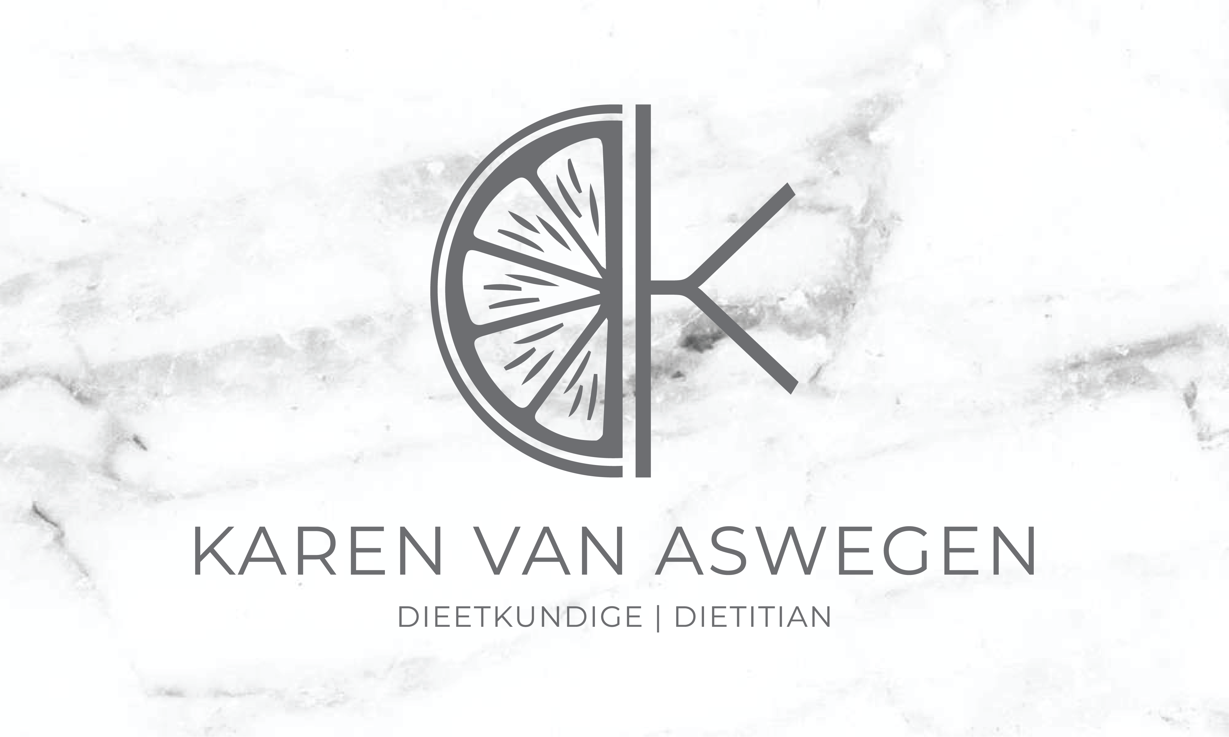
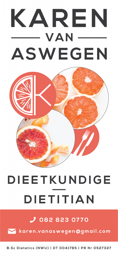
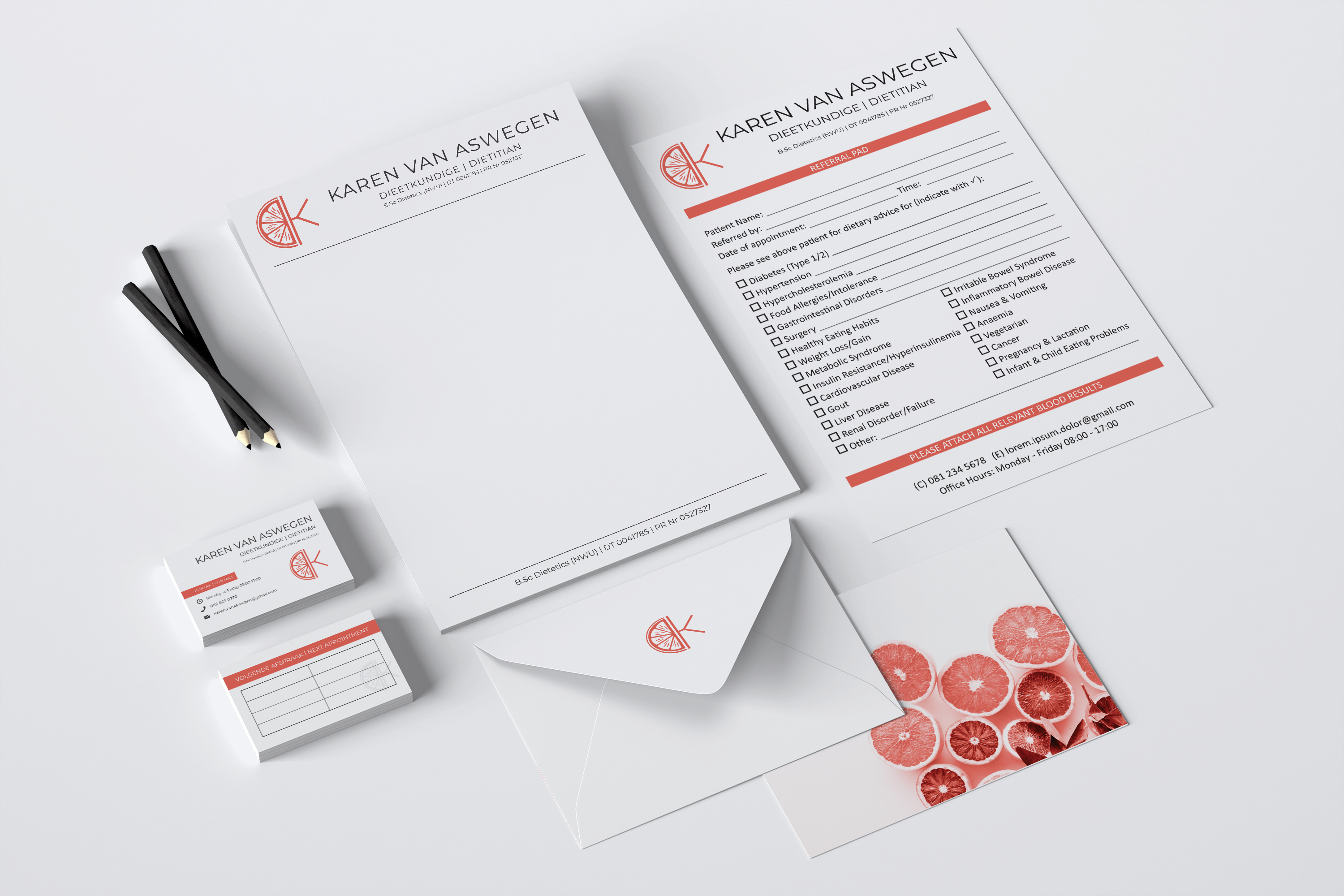
Karen started her own dietetics practice in 2014 when she was 23. At the time she designed her own logo. As a result of the success and growth of her practice, she decided it was time for a new look. The words that I would use to describe this brand are; clean, modern, professional, fresh, and fun.
To keep the design clean and relevant, I used all caps sans serif lettering. Since Karen’s original logo was a green grapefruit slice, I decided to keep the citrus theme for nostalgia sake. I then combined it with the ‘K’of her name to create her primary brand image.